
Overview
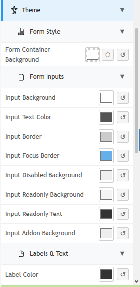
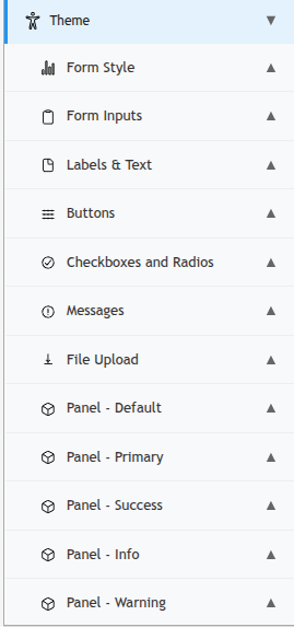
The Theme section in the Edit Form sidebar lets you customize the visual appearance of your form — including colors for the form container, input fields, and labels. Changes preview live on the form canvas as you make them.
Light and Dark Mode
At the top of the Form canvas (above the form fields), a Theme selector lets you switch between Light and Dark mode. This controls the default display mode shown to users when they open the form.
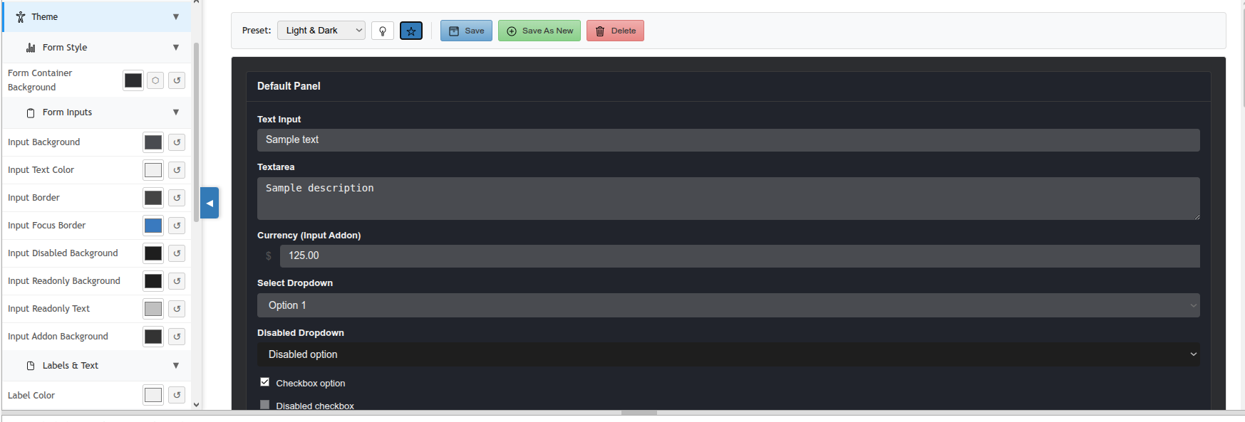
Users may also be able to toggle mode themselves if the form is configured to allow it.
Form Style
Form Container Background
Sets the background color for the entire form container. Click the color swatch to open the color picker, or click the reset button (↺) to restore the default.
Form Inputs
Controls the appearance of all input fields on the form:
|
Setting |
Description |
|---|---|
|
Input Background |
Background color of text inputs, dropdowns, and other input fields. |
|
Input Text Color |
Color of text entered into input fields. |
|
Input Border |
Border color of input fields in their default state. |
|
Input Focus Border |
Border color when an input field is focused (clicked into). Defaults to blue. |
|
Input Disabled Background |
Background color of input fields that are disabled (not editable). |
|
Input Readonly Background |
Background color of read-only input fields. |
|
Input Readonly Text |
Text color for read-only field values. |
|
Input Addon Background |
Background color for input addons (e.g., picker buttons attached to an input). |
Labels & Text
|
Setting |
Description |
|---|---|
|
Label Color |
Text color for field labels displayed on the form. |
Resetting to Defaults
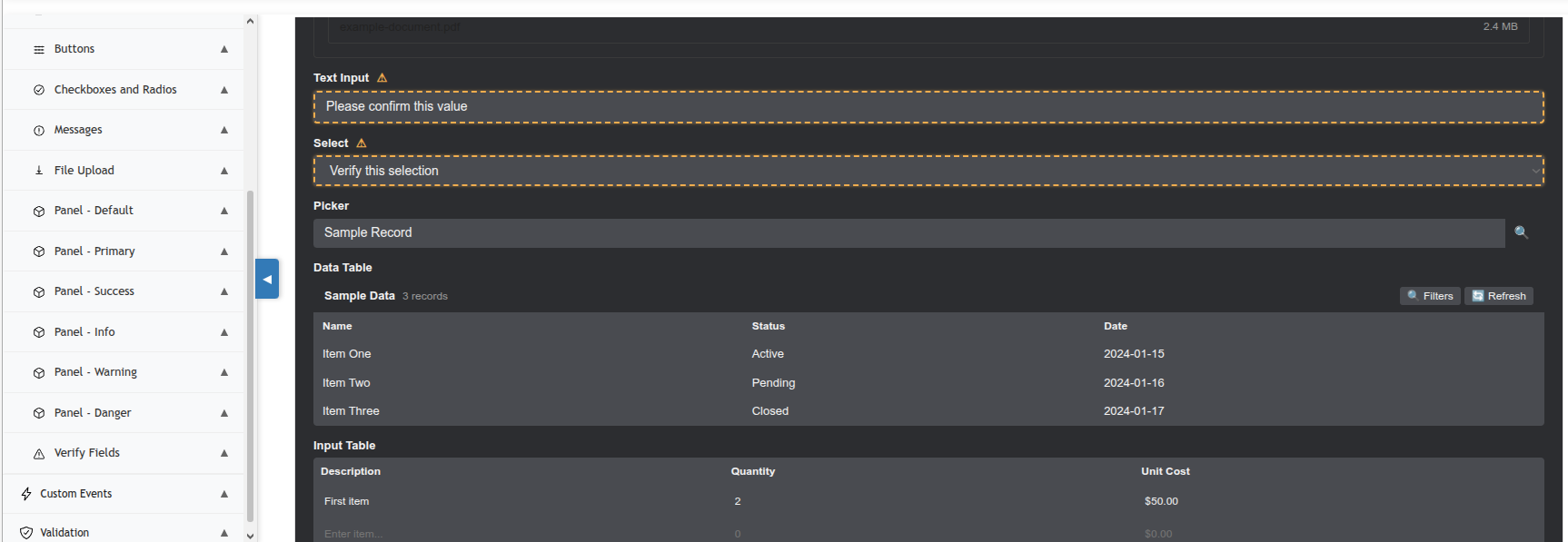
Each color setting has a reset button (↺) to its right. Click it to restore that individual setting to its system default. To reset all theme settings at once, you can reload the default theme from the Theme section header controls.
Theme customizations apply to this form only. They do not affect other forms or the PCR-360 system theme.