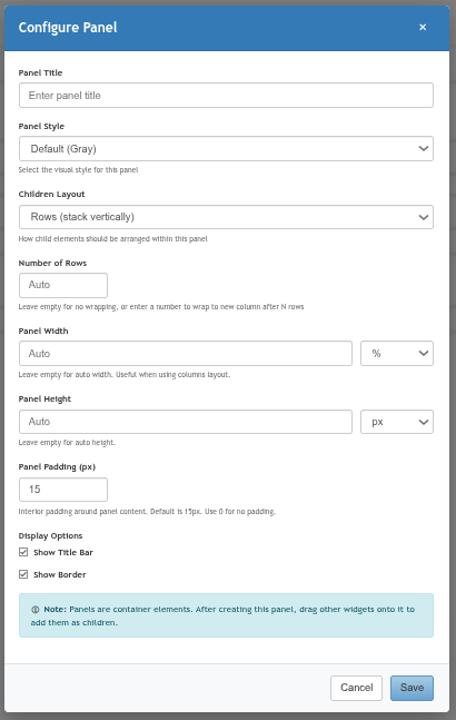
Overview
The Form section of the Edit Form editor provides a palette of field widgets you can drag onto the form canvas to build your form. Click any placed widget on the canvas to open its configuration dialog.
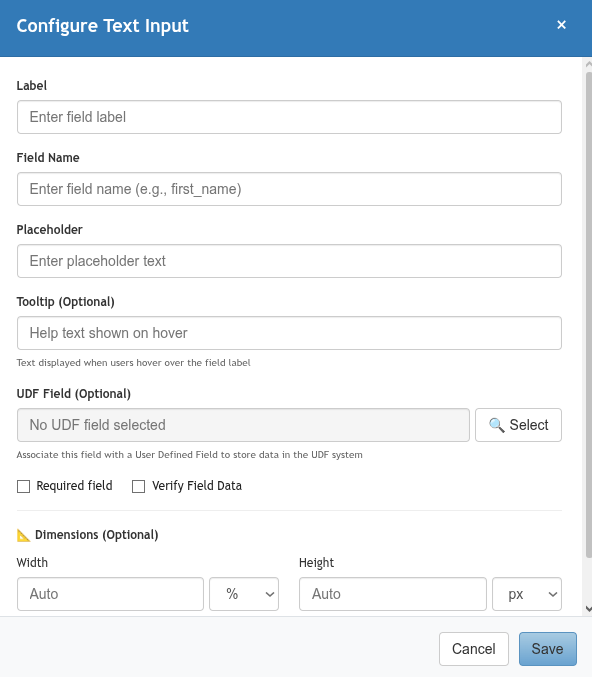
Common Configuration Fields
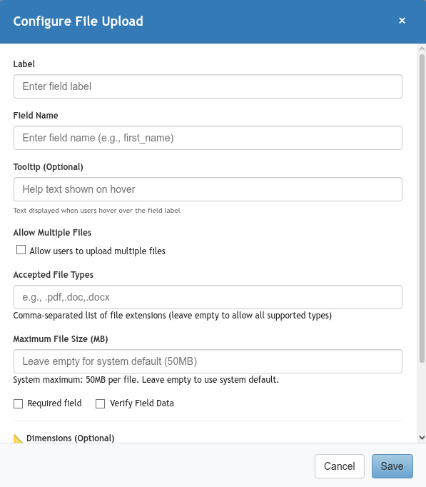
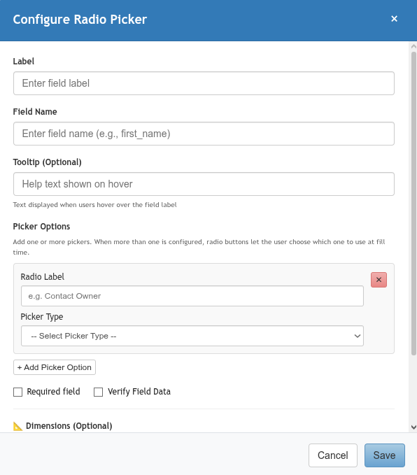
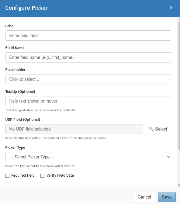
Most widgets share the following configuration options:
|
Field |
Description |
|---|---|
|
Label |
The visible label displayed above or beside the field on the form. |
|
Field Name |
The internal key for this field (e.g., |
|
Placeholder |
Hint text shown inside the field when it is empty. |
|
Tooltip (Optional) |
Help text displayed when a user hovers over the field label. |
|
UDF Field (Optional) |
Associates this widget with a PCR-360 User Defined Field, storing the submitted value in the UDF system. Click Select to choose a UDF. |
|
Required |
When checked, the form cannot be saved unless this field has a value. |
|
Verify Field Data |
When checked, adds a second confirmation field to verify the entered value (useful for email addresses). |
|
Dimensions (Optional) |
Sets the Width and Height of this individual field. Use |
Basic Inputs
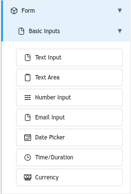
Standard data entry fields for capturing text, numbers, dates, and similar simple values.
|
Widget |
Description |
Common Use Cases |
|---|---|---|
|
Text Input |
A single-line free-text entry field. Supports placeholder, tooltip, UDF association, required flag, and optional data verification. |
Names, reference numbers, short answers, subject lines |
|
Text Area |
A multi-line free-text entry field. Ideal for longer responses. |
Descriptions, comments, notes, problem statements |
|
Number Input |
An input that accepts numeric values only. Rejects non-numeric characters. |
Quantities, port numbers, counts, ID numbers |
|
Email Input |
A text input that validates the entered value as a properly formatted email address. |
Contact email addresses, notification recipients |
|
Date Picker |
A calendar-based date selection control. Returns a formatted date value. |
Request dates, due dates, scheduled dates, start/end dates |
|
Time Duration |
A field for capturing a duration expressed in hours and minutes. |
Estimated effort, work duration, time tracking |
|
Currency |
A numeric input formatted as a currency value (e.g., $1,250.00). |
Cost estimates, budget amounts, invoice values |
Selection
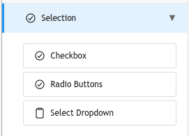
Widgets that let users choose from a defined set of options.
|
Widget |
Description |
Common Use Cases |
|---|---|---|
|
Checkbox |
A single true/false toggle. When checked, the value is |
Opt-in acknowledgements, boolean flags, yes/no questions |
|
Radio Buttons |
Presents a list of options as radio buttons where only one can be selected at a time. Options are defined in the widget configuration. |
Priority levels, mutually exclusive categories, small option sets |
|
Select Dropdown |
A dropdown list where users select one option from a configurable list. Better than radio buttons for longer option lists. |
Department selection, status selection, location lists, urgency levels |
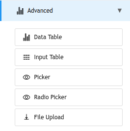
Advanced
Specialized widgets for complex data entry or PCR-360 record selection.
|
Widget |
Description |
Common Use Cases |
|---|---|---|
|
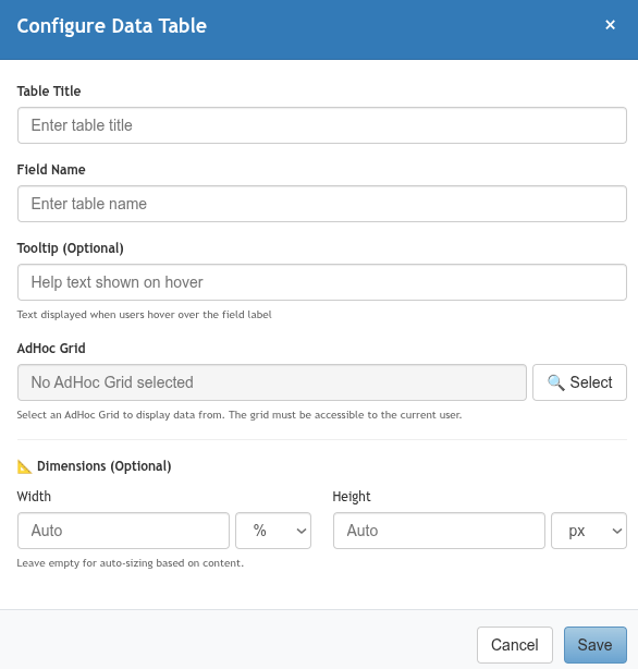
Data Table |
A read-only table that displays records queried from a PCR-360 database table. Configured with a data source and displayed columns. Users can view but not edit the data. |
Showing existing services, listing current equipment, displaying reference data |
|
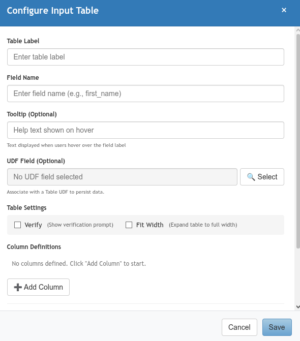
Input Table |
An editable table where users can add, edit, and remove rows of structured data. Each column corresponds to a sub-field. |
Multi-item equipment requests, listing multiple locations, itemized lists |
|
Picker |
A PCR-360 record search-and-select control. Opens a search dialog where users find and select a record from a configured PCR-360 table (e.g., Contacts, GLAs, Equipment). Returns the selected record's key. |
Selecting a GLA, choosing a contact, picking a piece of equipment |
|
Radio Picker |
Similar to the Picker, but displays search results as radio buttons rather than a grid. Best for fields with a small, predictable result set where the user should select one record. |
Owner fields (Contact Owner vs. Department Owner), selecting from a short list of options |
|
File Upload |
Allows users to attach one or more files to the form submission. Files are stored with the submission record. |
Attaching supporting documents, uploading photos, submitting signed forms |
Layout
Structural widgets for organizing the form's visual layout.
|
Widget |
Description |
Common Use Cases |
|---|---|---|
|
Panel |
A collapsible container that visually groups related fields under a titled section. Drag other widgets inside the panel to add them to that group. Users can expand or collapse panels to focus on relevant sections. |
Grouping contact information fields, separating billing details from service details, organizing long forms into named sections |