
Overview
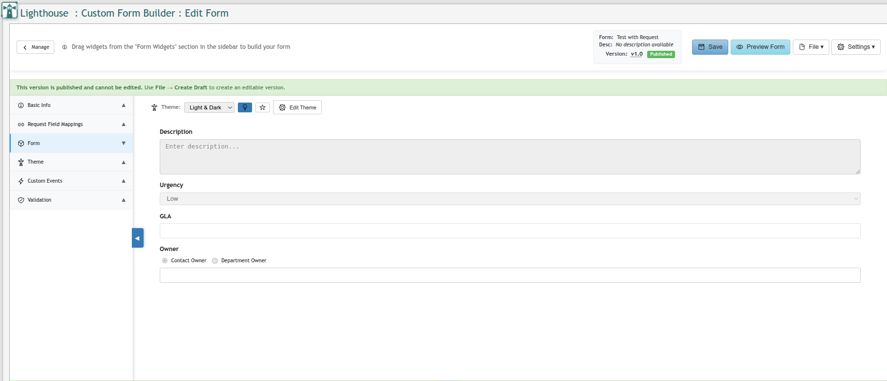
The Edit Form page is the main Form Builder editor. It provides a drag-and-drop canvas for designing form layouts, along with controls for managing versions, previewing, and configuring form behavior.
Published versions are read-only. If you open a Published form, a green banner will appear at the top: "This version is published and cannot be edited. Use File → Create Draft to create an editable version."
Top Bar — Left
Manage Button
The Manage button (top-left, with a back arrow) returns you to the Manage Forms grid without saving any unsaved changes.
Top Bar — Right
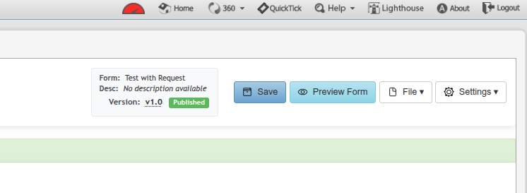
The right side of the top bar displays the form's identity and provides action buttons:
-
Form name — the display name of the current form
-
Desc — the form description (or "No description available" if not set)
-
Version — the current version number with a status badge (Published or Draft)
Save
Saves all current changes to the form. Only available on Draft versions.
Preview Form
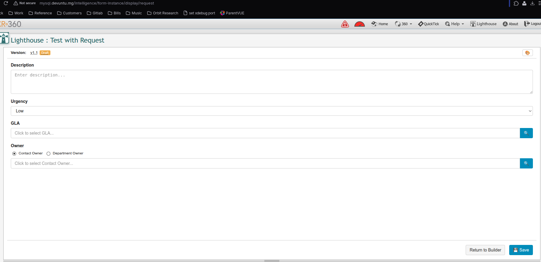
Opens a live preview of the form in a new tab (at /intelligence/form-instance/display/request?), showing exactly what end users will see. A Return to Builder button appears at the bottom of the preview to come back to the editor.
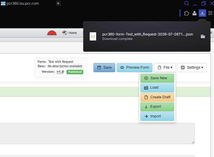
File ▼ Menu
|
Option |
Description |
|---|---|
|
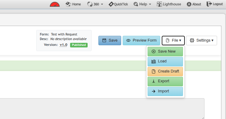
Save New |
Saves the current form as a new version. |
|
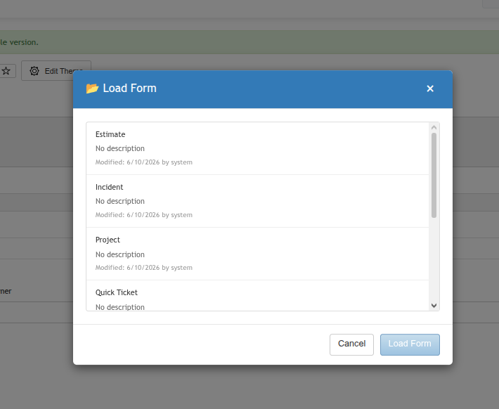
Load |
Opens a dialog to load a different version (published or draft) of this form. Useful for reviewing version history. |
|
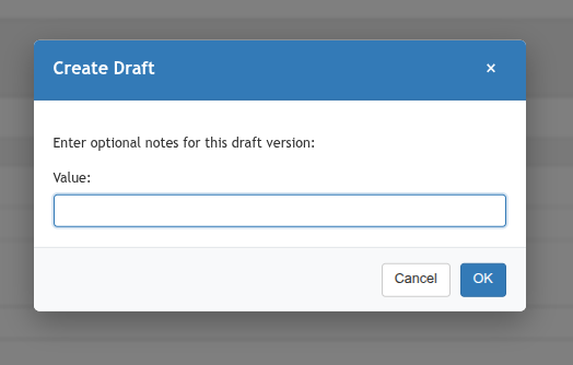
Create Draft |
Creates an editable draft copy from the current published version. Required before making any changes to a published form. |
|
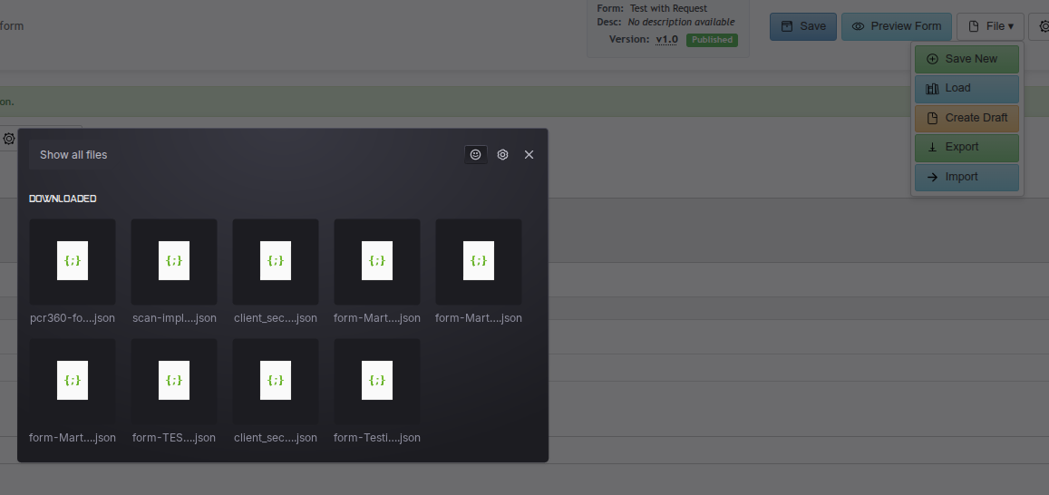
Export |
Downloads the form definition as a JSON file. Use to back up a form or transfer it to another environment. |
|
Import |
Loads a form definition from a previously exported JSON file, replacing the current form's widget configuration. |
Settings ▼ Menu
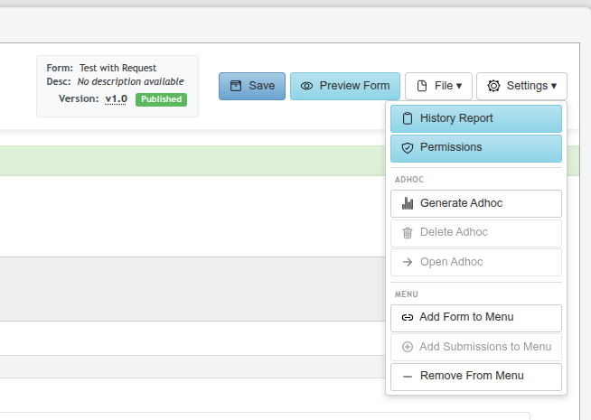
|
Option |
Description |
|---|---|
|
History Report |
Opens a report showing the change history for this form. |
|
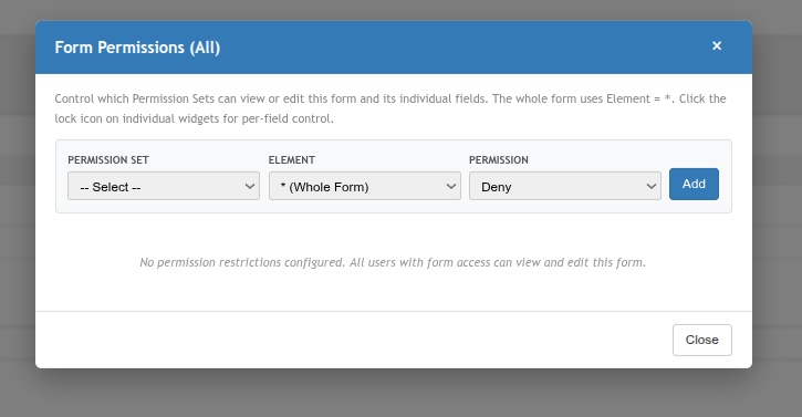
Permissions |
Opens the permissions dialog to control which users or groups can view or submit this form. |
|
Ad Hoc |
|
|
Generate Adhoc |
Creates a dedicated grid (Ad Hoc) for viewing all submissions of this form. Must be run once before the grid is available. |
|
Delete Adhoc |
Removes the generated Ad Hoc submissions grid. |
|
Open Adhoc |
Navigates directly to the form's submissions grid. |
|
Menu |
|
|
Add Form to Menu |
Adds a direct link to this form in a selected Lighthouse menu folder. |
|
Add Submissions to Menu |
Adds a link to this form's submissions (Ad Hoc) grid in a selected menu folder. |
|
Remove from Menu |
Removes a previously added menu link for this form. |
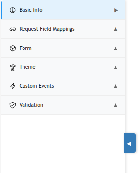
Left Sidebar Sections
The left sidebar organizes the form configuration into collapsible sections. Click any section header to expand or collapse it.
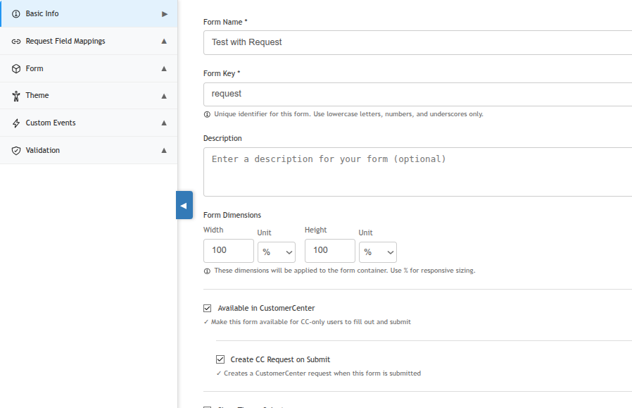
Basic Info
Defines the core identity and behavior of the form.
|
Field |
Description |
|---|---|
|
Form Name (required) |
The display name shown to users when they open the form. |
|
Form Key (required) |
A unique internal identifier. Use lowercase letters, numbers, and underscores only (e.g., |
|
Description |
Optional text describing the purpose of the form. Shown in the form editor header. |
|
Form Dimensions |
Sets the Width and Height of the form container. Use |
|
Available in CustomerCenter |
When checked, this form becomes available to CC-only users in the CustomerCenter portal. |
|
Create CC Request on Submit |
Visible only when "Available in CustomerCenter" is enabled. When checked, a CustomerCenter Service Request is automatically created each time this form is submitted. |
Request Field Mappings
Maps form widget values to fields on the CC Service Request that is created on submission. Only applicable when both "Available in CustomerCenter" and "Create CC Request on Submit" are enabled.
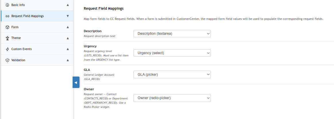
|
Request Field |
Description |
|---|---|
|
Description |
Maps to the Request's description text field. Use a Text Area widget. |
|
Urgency |
Maps to the Request's urgency level. Must use a widget bound to the URGENCY list type (e.g., a Select Dropdown). |
|
GLA |
Maps to the General Ledger Account (GLA_RECID). Use a Picker widget configured for GLAs. |
|
Owner |
Maps to the Request owner — either a Contact (CONTACTS_RECID) or Department (DEPT_HIERARCHY_RECID). Use a Radio Picker widget. |
Form
The main design canvas. Drag field widgets from the palette on the right side of the canvas onto the form area to build the form layout. Click any placed widget to open its configuration dialog. See Form Field Widgets for a full reference of all available widget types.
Theme
Controls the visual appearance of the form including colors for inputs, labels, and the form container. See the Theme child page for full details.
Custom Events
Hooks custom server-side logic into the form's lifecycle (on load, on save, on delete). See the Custom Events child page for full details.
Validation
Attaches custom server-side validators that run before a form instance is saved. See the Validation child page for full details.