The Grid
Overview
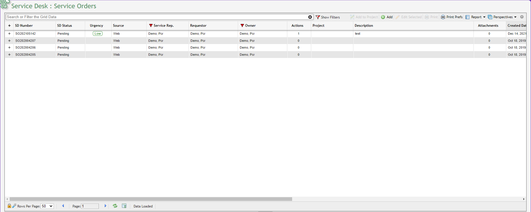
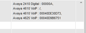
Example of a Grid
The Grid is the primary interface through which Users can manage their organization's resources and information. Plainly speaking, the Grid is a flexible, interactive table that makes it easy for Users to access their data.
Selecting Multiple Lines
Users can highlight multiple items using a Windows standard method. Select the first line then shift-click to select a range or Ctrl-click to select more than one line.
Subgrids
Sometimes, records displayed in Grids are more complex or represents a collection of related records (such as 'Messages'). When a Sub-Grid is expanded, PCR-360 will automatically generate the count of related records. Multiple Sub-Grids may be opened or closed as desired on the same Grid at once. The first time a Sub-Grid is opened, results will be queried, if it is later closed and reopened, as long as the data within the Grid has not changed, the results will not be queried again. Some complex Sub-Grids (such as the User Management: Roles Grid) display a count of related records.
Grid Toolbar

Each Grid features a Grid Toolbar located immediately above the Grid itself. While the icons that populate the Grid Toolbar depend on the nature of the Grid, Users can typically access the Grid Toolbar to search the Grid, add or delete items from the Grid, and edit existing items on the Grid.
Users can also access the Grid Toolbar to generate Grid reports and define Grid preferences.
Searching
A User can search for items on any Grid by inputting a search term(s) into the box labeled 'Search or Filter Grid Data' located on the Grid Toolbar. This field searches all columns on a Grid so it is effective if you don’t know where the data is but much slower than using column filters. Enter the search value into the text field and press Enter/Return. 
To revert to the original search Grid settings, remove any terms from the search box.
Filters & Sorting
To display all column filters currently applied to a Grid, Users can click on the  button located on the Grid Toolbar. By applying additional filters, a User can search for a specific item or group of items with superior precision. From this control area, Users can change the logical operator used for connecting filters (AND vs. OR), remove filters, or clear all current filters. Note that clearing all filters doesn't remove terms entered in the Basic Search tool.
To save screen space, Users can hide the filter display by clicking the  button.
Filtering individual columns
Single-click the column header on which you want to search, enter the search value, and click Add Filter.
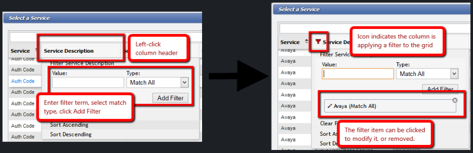
Note: You may add as many Filters as you like to the same column or multiple columns. When a filter is added to a column, a  is placed in the header. Note: you can make the search even more specific by clicking on the Filter Type drop-down and choosing one of the other search options. The options shown depends on the type of data in that column.
Advanced Filtering
Users have the ability to search relative dates using the Date/Time filters. If the User searches using x days to y days, "Through", "thru", and "to", are interchangeable and will provide the same result. The "+" is for future dates, and the "-" is for past dates. Additionally, the language parsing will take all of these values: "Year/Years" "month/months" "day/days" "week/weeks" "hour/hours" "minute/minutes" "second/seconds".
" to -30 days" - For all records older than 30 days.
The space before " to" is critical for past dates. The parser will not recognize this string: "to -30 days" but will recognize " to -30 days".
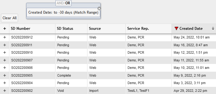
All records older than 30 days
"10th of last month - 24th of this month" - This displays all records from the 10th of last month to the 24th of this month.
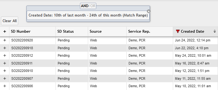
all records from the 10th of last month to the 24th of this month
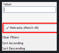
Change Search Terms on an Existing Filter
Click the column header of the Search Term you wish to change. Once you've opened the Filter you can click on the existing Search Term to populate the Value field. After you've changed it to the desired value, click the  button.
Removing an Existing Filter
There are a couple of methods to do this:
Click the column header that contains the Filter, and then click the
 icon.
icon.
OR
Click the
 button.
Then click the
icon.
OR
Click the
button.Then click the
 button.
Note: You can have multiple Filters (search terms) on the same column.
AND vs OR Filtering with Match Any
AND Filter Example
OR Filter Example
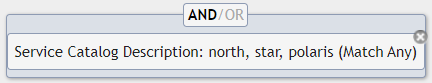
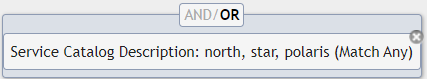
Match Any will take the provided value, split it up on comma, and apply each item as an OR condition, so if any value in the comma list is a match, the row will be included:
COLUMN_A Match Any:"north, star, polaris"The above filter then becomes:
(COLUMN_A LIKE '%north%' OR COLUMN_A LIKE '%star%' OR COLUMN_A LIKE '%polaris%')When a User provides a comma-separated list of values to that filter type, it will build separate conditions from each value, then include that with any other search/filter conditions.
For Example: using the default AND filter connection (under "Show Filters" on the grid).
COLUMN_A - unfiltered
--------
North Pole: Santa
North Pole: Bears
South Pole and Pittsburgh: Penguins
The North Star is in the Small Bear constellation
Northern Lights are trippy
I've never seen Northern Lights, nor penguins
Apply filter Starts With:"north" to COLUMN_A, you get only records that start with "north" (filters are not case-sensitive). In this case, "Northern" also matches, even though it's not the exact word "north".
COLUMN_A - [Starts With: "north"]
--------
North Pole: Santa
North Pole: Bears
Northern Lights are trippy
If a User filter further for rows that have "santa" or "bears", two separate filters for Match All:"santa" then Match All:"bears" will not work because no results will be displayed, since there are no rows that start with "north" AND have "santa" AND have "bears" in COLUMN_A.
The User must instead add Match Any:"santa, bears".
The list gets split up and builds a condition group that expands to:
Starts With:"north" AND (HAS:"santa" OR HAS:"bears")
The results should now look like:
COLUMN_A - [Starts With: "north" AND (Has "santa" or Has "bears")]
--------
North Pole: Santa
North Pole: Bears
Now you clear all filters. You want to see the row that starts with "Northern Lights" but no others with that phrase. You also want to see any rows that mention "south" or "bear". Filtering by Match Any:"northern lights, south, bear" doesn't work because anything that HAS "northern lights" will be included.
Instead, set one filter Starts With:"northern lights" and a second filter Match Any:"south, bear". Initially, no results will show up. Click the "Toggle Filters" button and switch the condition connector to OR.
The results should now look like:
COLUMN_A - [Starts with: "northern lights" OR Has "south" OR Has "bear"]
--------
South Pole and Pittsburgh: Penguins
The North Star is in the Small Bear constellation
Northern Lights are trippy
because the conditions are: Starts With:"northern lights" OR (HAS "south" OR HAS "bear").
Grid Buttons
Adding an Item to a Grid
Most Grids allow Users to add new items to their lists. To add an item to a Grid, simply click the  button on the Grid Toolbar.
To save a new item to the Grid, the User must click the  button located at the bottom of the Data Entry Form in order for the item to be saved in the Grid. The new item appears in the appropriate Grid.
Opening an Existing Item on a Grid
To open an item on the Grid, simply double-click that item. On most Grids, an item can also be opened by highlighting the item with a single click and selecting the  button located on the Grid Toolbar.
By double-clicking or opening a specific item on the Grid, the User is presented with a Data Entry Form. A User can exit this form at any point and return to the Grid from which it came by clicking the 'X' in the top right corner of the form. Deleting the item closes the form, as will saving the item if the appropriate preference is set to do so.
Deleting an Item from a Grid
To remove an item (or items) from a Grid, simply highlight each item to be removed by clicking on it once. Users can highlight multiple items using a Windows standard method. Select the first line then shift-click to select a range or Ctrl + click to select more than one line. To delete the highlighted items, click the  button located on the Grid Toolbar.
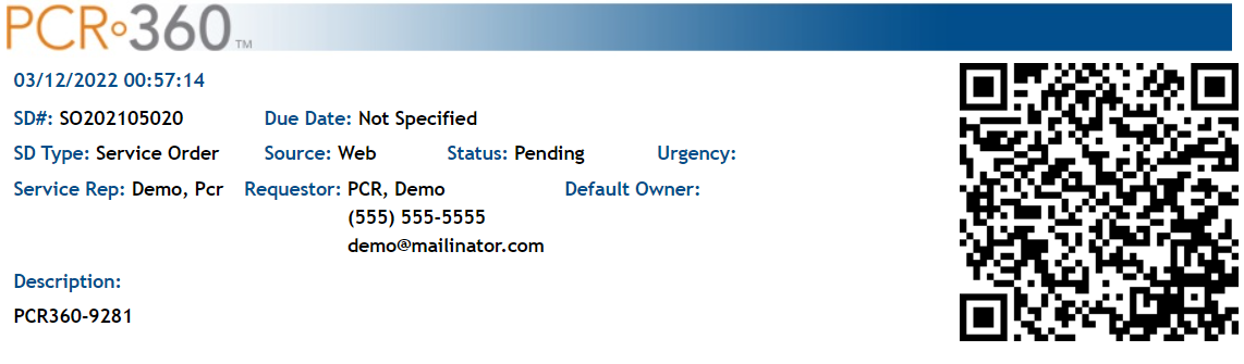
Example of a Print Out
Clicking 'Print' generates an HTML document of the Service being printed that is optimized for 8 1/2" x 11" printing. Only one row (item) in the Grid can be printed at a time. Printing from here gives a detailed break down of all the columns associated with the item which can be limited using the Print Prefs to get a specific Print based on User requirements.
There is an option to have either a QR Code or a bar code attached to a given printable document in the Configuration Guide to make tracking documents easier. From the Print Screen, a User can either click  or
or  . The PDF can be used in all the normal ways you might need a PDF file.
Print Prefs
To modify what rows generate on the printer-friendly tab, the User must click the  button. Any columns from the Grid can be selected or deselected here.
Perspectives
Once a Grid has been formatted to suit a User's needs, the User can save the specific Grid settings by accessing the  button located on the Grid Toolbar.
Create a New Perspective
Modify the Grid to reflect your perspective (add filters, move or hide columns, set the sort order, etc.). Click on  on the far right column header. Give the Perspective a Name. You can also optionally specify if the Perspective is the Default for that Grid for you, not for all Users and if it is Shared with other Users. Click
  .
.
Formatting a Grid for a Perspective
Each Grid can be customized to suit the User's immediate or long-term needs. Users can alter the Grid's appearance and organization, save specific settings, and eliminate unnecessary information.
Columns
Each Grid is organized by columns appropriate to the menu items they support. Columns can be made wider or narrower by clicking on the margin and dragging the line left or right. Each column can itself be moved among the other columns. By clicking on the column name, a User can drag the column left or right to its intended destination.
Moving/Re-Ordering Columns
There are two methods to re-order columns:
Click on a column header and drag it to a new position.
Click on .
In the Arrange Columns box, drag and drop the columns until they are in the desired order.
Hiding/Showing Columns
Users can also show or hide columns on the Grid. To do so, click on . In the Arrange Columns box, a checklist is displayed that includes each column that can be displayed in the Grid. To hide a column from the Grid, a User can uncheck the box next to the appropriate column. To show a column, a User can check the box next to the appropriate column.
Resize Columns
Users can resize the individual columns by hovering over the right-hand border of the column header and dragging the column to the desired width. Alternatively, automatically resize the column to fit the displayed data by double-clicking the right-hand border of the column header.
Sorting
To sort the Grid by the values in a specific column, simply click the desired column header then choose Sort Ascending or Sort Descending. You can also right-click a column header to toggle the sort on that column. Right-click again to reverse the sort order.
Rows
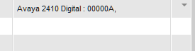
Some Rows are capable of displaying multiple pieces of information on several lines. For example, a Service may have multiple pieces of Equipment of Cable Paths. To make navigating the Grid easier, these additional rows of information are hidden by default. The extra Rows are collapsed and hidden from view. The first line of a list set displays in the collapsed row.
Collapse a Row
The Grid rows are collapsed by default. However, should a User wish to hide the additional row information after Expanding a row, locate the  button on the right-hand side of the grid near the scroll bar and click it and the grid hides the extra information.
Expand a Row
To show all the information in a row, the User must locate the  button on the right-hand side of the Grid near the scroll bar. This button is only present when there is data in a row that is hidden. When the button is located, the User can click it to reveal all the data hidden in the row.
Update a Perspective
Change the grid so it shows the desired information. Click on on the far right column header. Make sure you have the correct Perspective name in the Name field and click  .
.
Note: If you used search text input or Filters to limit the content of your Grid, these search parameters are also saved along with your Perspective so you don’t need to re-enter them every time.
Access a Perspective
Once the customized Grid settings have been stored, they can be accessed at any point. There are multiple ways to do this.
Click . From the 'View Saved Perspectives' form you can double-click a Perspective in either Grid or select one and click
You can also click on  and choose the desired Perspective from the drop-down list.
If at any time you want to switch back to the original perspective, click on  and choose Original Perspective.
Note: Grid Perspectives, combined with Grid Reporting, become a powerful way to filter, format, and create queries and reports you use all the time. Use the search and filters to limit only the items you want to see, format the Grid for the columns and column order you want, and save it. Then whenever you want to see this data or create a report on it, simply choose that Grid, and all the info is at your fingertips without re-doing any steps. And don't forget you can have as many Perspectives per Grid as you would like.
You can also set a Perspective to open from either a Browser or System Bookmark. Once the Bookmark is created, you can quickly jump to the Grid Perspective when needed.
How to create a Browser Bookmark:
Navigate to the Form with the Perspective you wish to Bookmark
Click the View Perspective link in the Options menu
Select your Perspective and click the
 button
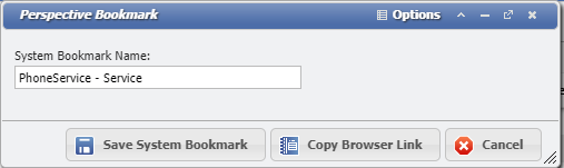
Perspectives Bookmark Form example
Click the
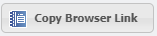 button
In your browser create a new Bookmark; the link location should have been copied to your clipboard
How to create a System Bookmark:
Navigate to the Form with the Perspective you wish to Bookmark
Click the View Perspective link in the Options menu
Select your Perspective and click the
buttonPerspectives Bookmark Form example
On the form enter a Bookmark name
Click the
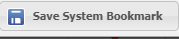 button
Note: When creating a Perspective Bookmark, remember if a Perspective is the Default Perspective for that Form, there is no need to use these processes. Every time a User Navigates to a Form, the Default Perspective will always be the first to load, unless you have manually created a Bookmark to the specific Perspective you wanted.
Auto-load Preference
The initial automatic load of Grid data can be controlled in two ways:
Per Grid in the Perspective
Globally for your User in the green Perspectives tab between Main and Admin
Adding User Defined Fields to a Grid (UDFs and UDCs)
If we have a User Defined Field that we would like to see in the Grid we can click on  and click the User Defined Columns text. This opens the 'User Defined Column' (UDC) form and we can select any of the User Defined Fields that we have added to the form. When we add these UDCs, they will be added as a searchable and filterable column to the Grid.
Reports
Adding Custom Reports
Custom Reports can be linked to a grid using the drop-down arrow next to the button and selecting the "Custom Reports" option. This will open the "Manage Report Links" form. This option is only available to system administrators.

Once a Report is attached to the Grid it will show up in the  drop-down menu. When a grid row is selected it the attached reports can be opened.
Generating Grid Reports
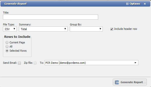
Users can generate a printable report (in HTML, PDF, or CSV format ) of any Grid or section of Grid by clicking on  (located on the Grid Toolbar). In the 'Generate Report' form, Users can generate reports from the Grid, by page, by row, or by selection.
To generate a report for the currently displayed grid results, press the 'Report' icon. From the Generate Report form, select 'Current Page' under 'Rows to Include'.
To generate a report for all grid results, press the 'Report' icon. From the Generate Report form, select 'All' under 'Rows to Include'.
To generate a report that includes multiple, specific items only, highlight each item in the Grid with a single click and press the 'Report' icon. From the Generate Report form, select 'Selected Rows' under 'Rows to Include'.
Some Grids also allow Users to further define their reports by 'Summary' and 'Group By'. In the 'Summary' field, Users can define a summary type: 'Total', 'Average', or 'Total and Average'. Once the report is generated, the appropriate summary type appears atop the report. This tells the User the amount of the 'Total', 'Average', or 'Total and Average' of the values in the specified Grid rows/sections.
The 'Group By' field allows Users to generate reports by Grid column. The 'Group By' drop-down menu lists the columns on the selected Grid. Keep in mind that if the User makes a 'Group By' selection, the report automatically includes every value in the column. This sets the 'Rows to include' selection to 'All' by default.
Scheduling Reports with Perspectives
Reports can be sent as an email on a schedule to automate the Reporting process for the User. There is a video on the process in the video tutorial Reporting.
Currently if any changes are made to the Perspective the scheduled report is tied to, the scheduled report is removed as the newly changed perspective is considered new. Whenever a Perspective is changed, any desired scheduled reports would need to be re-added.
There is no History Report for Perspectives or their scheduled reports. However, for SysAdmin Users, the 'Admin: Audit' grid does contain the changes made to the table 'USERS_PERSPECTIVE' which will provide most of the information needed to rebuild a lost Perspective. This grid does contain a large amount of records so it is recommended to begin looking by adding a filter to the 'Table Name' (USERS_PERSPECTIVE) and 'Date' columns.
To access the Schedule Report function of Perspectives, the User must first have a named and saved Perspective.
Click 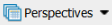 .
.
This will open the 'View Saved Perspectives' form.
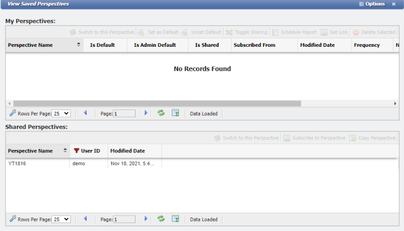
Select the Perspective you want to schedule from the My Perspectives section of the form.
Click  .
.
This will open the 'Schedule Report' form.
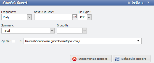
On this form set the Frequency, Next Run Date, File Type, and the emails to send that Report to the desired values and click  .
.
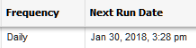
The Report will now be scheduled and reflected on the View Saved Perspectives form in the Frequency and Next Run Date columns.
Automatically Refresh
Grids can be set to automatically refresh on a specific interval. Click on  and check the box labeled "Automatically reload…" and enter the Refresh rate (in minutes).
Link to a Grid
On the View Saved Perspectives screen, when you select a Perspective, there is now a  that allows you to copy the URL link to that specific Grid perspective.
Page Navigation Toolbar

Each Grid features a Page Navigation Toolbar located immediately below the Grid itself.
Grid Permissions 
The button allows an Admin to set Grid level Permissions quickly.
AdHoc Builder 
The button allows an Admin to pull in the existing Grid query to modify and make an AdHoc grid quickly.
Page View
In order to alter the number of rows displayed on each page of a Grid, a User can access the drop-down menu located immediately below the bottom left corner of the Grid. A User can choose to view 10, 15, 25, 50, 100, 250, or 500 rows per page of Grid.
This functionality is universal across all Grids within PCR-360. Clicking the  or the
  will move the User between pages of the content that is loaded into the Grid. Users can click the
  icon to view a count of all the records that have loaded into the Grid. Once the number of records has been counted, the Page Number field on the Toolbar will become editable.
Refreshing a Grid
To update the Grid data with any changes made since it was last loaded, click  next to the Page Navigation bar. Refreshing a Grid does not affect the User's Grid settings.
Copy a Grid Cell
To copy information from a Grid Cell, right click on the selected cell. This will display a  button. Clicking the Copy Cell button will copy the text inside the cell to the clipboard.
Count Info
To see how many records are present in a Grid, see our page for The Count Report.
Training Videos
Grid Basics
This video series will get a User started to use PCR-360.
Columns and Sorting
What is a Grid? How to sort data in the grid, and organize the data.
Searching and Filtering
How to Search and Filter the data in the Grid.
Perspectives
Saving the sorted and filtered data.
Reporting
Saving the sorted and filtered data.