The 'CustomerCenter Administration' manager is only accessible to sysadmins through the admin section of the back-end interface.
The Theme Manager allows for the customization of the front-end look and feel of the CustomerCenter. Menus and Links allows for the customization of the appearance of Menus and Links within the CustomerCenter. Custom Content allows for the customization of Widgets that are displayed across the CustomerCenter Portal.
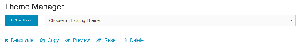
Theme Manager
Theme Manager Page Example
The Theme Manager is divided into different sections depicting different areas of CustomerCenter. Themes may be saved for later revision or activation, saved Themes are grouped together in the dropdown next to the
button. Once a saved theme is selected, options to edit, preview, activate, copy or delete the theme will be available.
Theme Name: Descriptive name of the theme in the theme manager.
Reset Theme button: Reset the theme to default settings.
Preview Theme button: Allows the User to preview the theme settings. Clicking will redirect the User to the home page with styling for the current theme setting being previewed. A header notice will bring you back to the theme manager.
Theme Logo: Upload an image to replace the theme logo displayed in the upper left of every CustomerCenter page.
Website Title: Modify the website title displayed in the tab of a browser window.
Welcome Message: Change the welcome message displayed on the home page.
Custom Font: All text within CustomerCenter can be updated to match your Organization's style of choice. PCR-360 has the available fonts:
Helvetica Neue
Roboto
Antic Slab
Trispace
Slabo
Raleway
Nunito
Lora
Work Sans
Noticia Text
Lato
Lucida Bright
Tahoma
Palatino
Arial
Note: Helvetica Neue is the default font within CustomerCenter
Deactivate Theme example
To deactivate a theme, first, select the activate theme from the "Choose an Existing Theme" drop-down menu. This will activate the "Deactivate", "Copy", "Preview", "Reset", and "Delete" buttons. Click the "Deactivate" button and "Yes" on the ensuing pop-up to deactivate the current theme and apply the default theme.
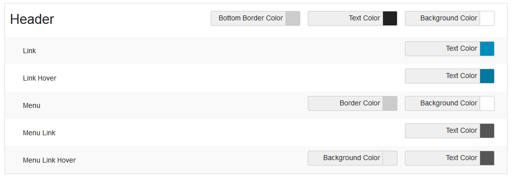
Header
The header section includes options to change various element colors including:
General settings for changing the Bottom Border Color, Text Color and Background Color.
Link: Text Color.
Link Hover: Text Color.
Menu: Border Color and Background Color.
Menu Link: Text Color.
Menu Link Hover: Background Color and Text Color.
Body/Content
This section includes options to change various element colors in the main content/body section of CustomerCenter. Options include:
Text color and background color.
Link: Text color.
Link Hover: Text color.
Pagination Current Page: Background color and text color.
Primary button: Background color and text color.
Primary Button Hover: Background color and text color.
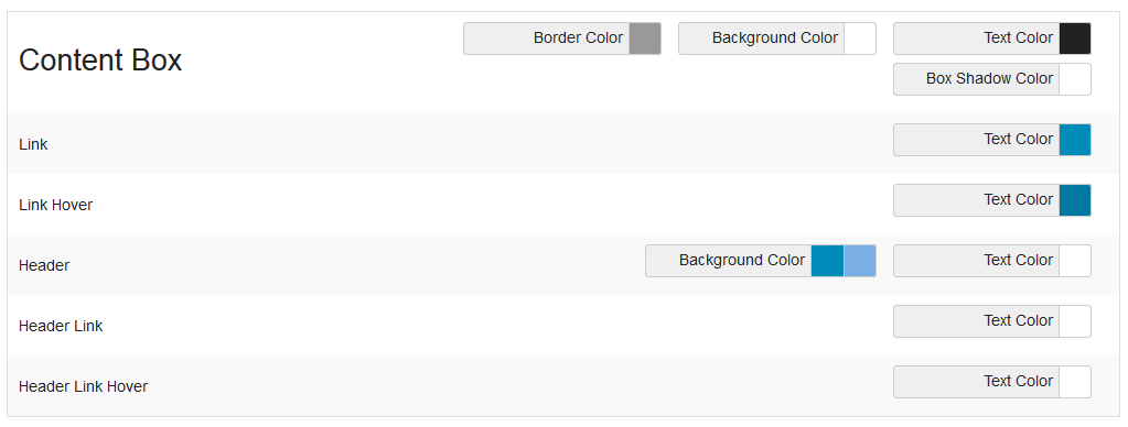
Content Box
This section controls the color assignments of various elements in the content box section of CustomerCenter including:
The general Border Color, Background Color, Text color and Box Shadow Color.
Link: Text Color.
Link Hover: Text Color.
Header: Background Colors and Text Color.
Header Link: Text Color.
Header Link Hover: Text Color.
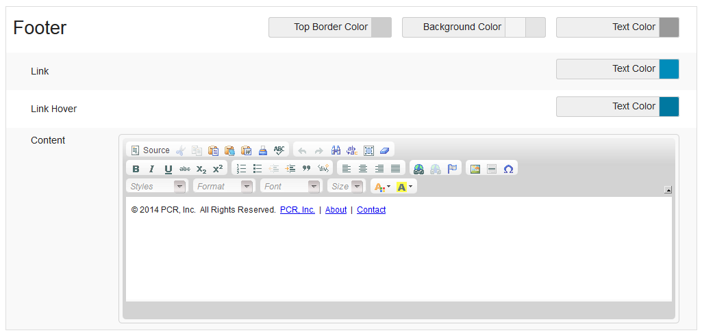
Footer
The footer is a good place for a given organization to place a contact email. For example, the Help Desk email for PCR is help@pcr.com. By using the footer to include the organizations general help email, an Admin can ensure that all the Customers using the CustomerCenter will email a single contact point for tracking purposes. Using the editor, the Admin can link to the email to automatically open email programs.
Styling for the footer section of the page including:
Top Border Color, Background Color, Text Color.
Link: Text Color.
Link Hover: Text Color.
Content: Content to display in the footer.
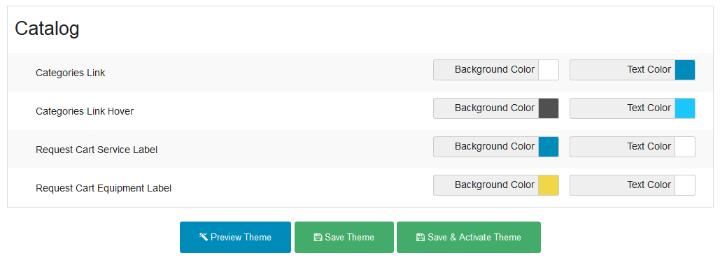
Catalog
Example Catalog Manager
This section includes styling of the catalog categories and cart labels:
Categories Link: Background Color and Text Color.
Categories Link Hover: Background Color and Text Color.
Request Cart Service Label: Background Color and Text Color.
Request Cart Equipment Label: Background Color and Text Color.
Request Tracking Activity Types
This section allows a User to change the default style used for how Request Tracking displays various Requests are Created, Updated, or when Remarks are added to them.
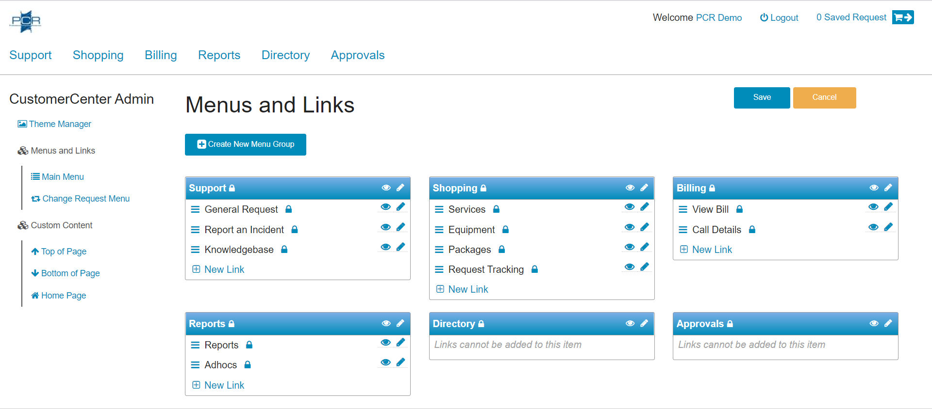
Menus and Links
Main Menu Customization Page
The Menus and Links section allows a User to update Menu and Link permissions and labels to further customize the appearance of your Organization's CustomerCenter. It also allows for changing the Order or currently available Menus and Links, as well as creating new Menus and Links to display.
Once updated are finished, a User can click the
button to keep the changes, or click the button to revert the changes. When Menu and Link title changes are saved, the application will immediately update to the new titles, without requiring Users to refresh the page in order to see the update.
When an item is deleted, it will still display on the screen until the changes are saved. The Menu/Link will display similar to the below image:
Example of an Unsaved, Deleted, Menu
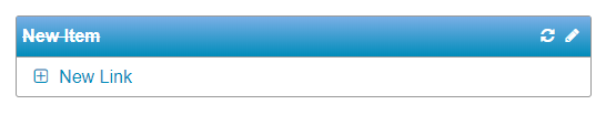
Menus
Menus can be dragged around the page to change the order in which the Menu Options appear within the CustomerCenter Navigation Menu. Menu Items display in order from right-to-left, and top-to-bottom.
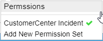
- When the Permission Builder Icon is clicked, it allows the User to view what types of Users can access the Menu and its Links.
Permissions Dropdown Menu example
The Permissions Dropdown Menu opens when the User hovers over on the Permission Builder Icon. It displays all Permission Sets that grant access to the Menu. Clicking on any selection opens the Permission Sets Grid so that the User can update the Permissions.
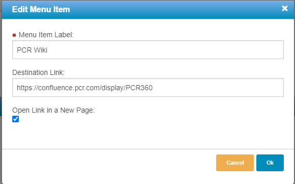
- When the Edit Icon is clicked, the Menu text can be edited from the Edit Menu Item form.
Edit Menu Item Form Example
The Edit Menu form allows the user to configure the displayed label and destination for the User to be navigated to. Users can also enable new pages to open for the navigation.
Note: The Destination Link for Default PCR-360 locations can not be edited.
- When the Show Icon is displayed, the Menu will be displayed to Users. - When the Hide Icon is displayed, the Menu and all of its Links will be hidden to Users.
- When the Delete Icon is clicked, the Menu and all of its Links will be deleted
Note: Default PCR-360 Links can not be deleted.
- When the Undo Icon is clicked, the deleted Menu and all of its Links will be restored. This only appears before the changes have been saved.
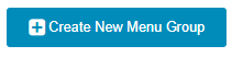
New Menu options can be created by clicking the
button. A new Menu Item will appear in the list of available Menu Options, and be editable.
Links
Users can use the Link Sorting Icon (
) to change the order Links are listed within a Menu. Links cannot be moved between different Menus through this feature. - When the Permission Builder Icon is clicked, it allows the User to view what types of Users can access the Link.
Permissions Dropdown Menu example
The Permissions Dropdown Menu opens when the User hovers over on the Permission Builder Icon. It displays all Permission Sets that grant access to the Link. Clicking on any selection opens the Permission Sets Grid so that the User can update the Permissions.
- When the Edit Icon is clicked, the Link text can be edited from the Edit Menu Item form.
Edit Menu Item Form Example
The Edit Menu form allows the user to configure the displayed label and destination for the User to be navigated to. Users can also enable new pages to open for navigation.
Note: The Destination Link for Default PCR-360 locations can not be edited.
- When the Show Icon is displayed, the Link will be displayed to Users. - When the Hide Icon is displayed, the Link will be hidden to Users. - When the Delete Icon is clicked, the Link will be deleted.
Note: Default PCR-360 Links can not be deleted.
- When the Undo Icon is clicked, the deleted Link will be restored. This only appears before the changes have been saved. - When the Delete Icon is clicked, the Menu and all of its Links will be deleted
Note: Default PCR-360 Links can not be deleted.
- When the Undo Icon is clicked, the deleted Menu and all of its Links will be restored. This only appears before the changes have been saved.
New Menu options can be created by clicking the
button. A new Menu Item will appear in the list of available Menu Options and be editable.
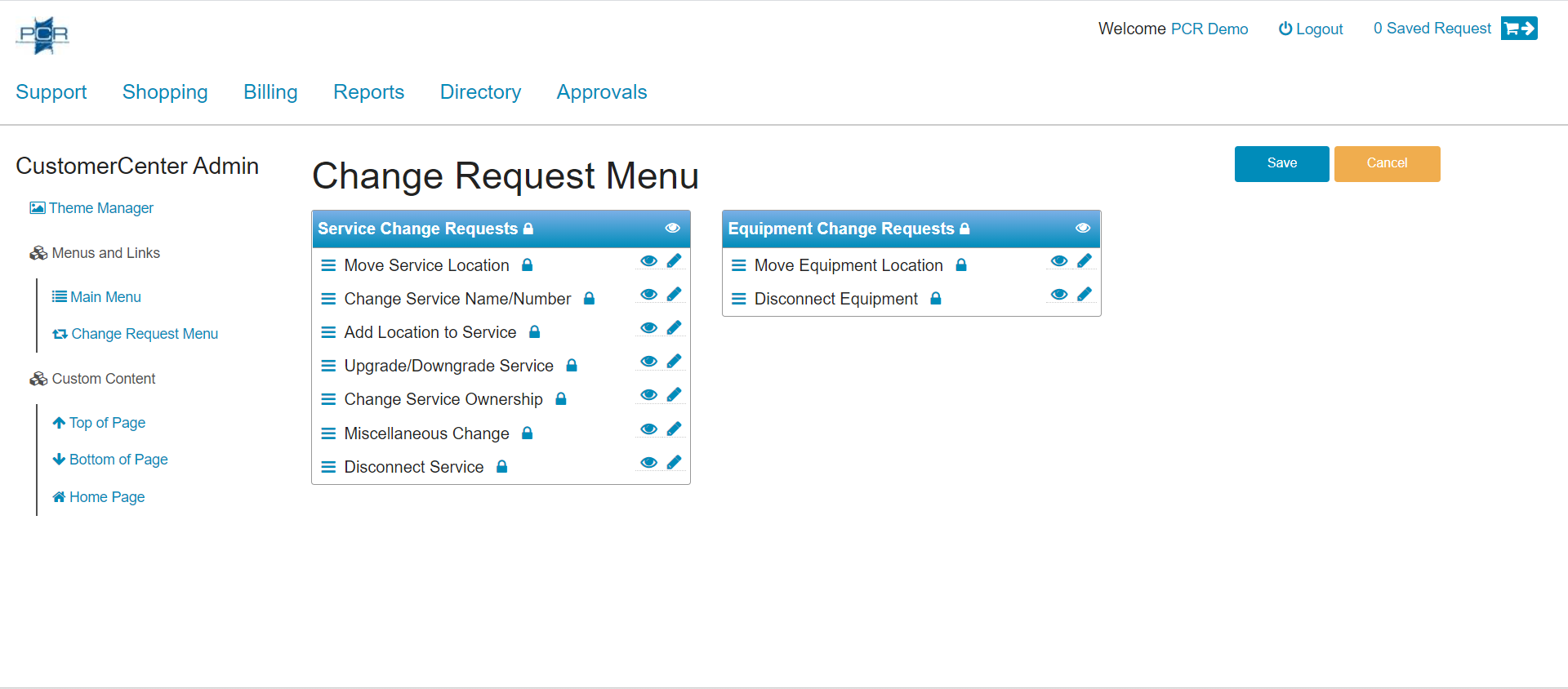
Change Request Menu
Change Request Customization Page
Much like the Main Menu, the Change Request Menu that is available on the My Services/Equipment and Department Services/Equipment Widgets can be customized to use the terminology used within your organization, and the order they appear in the menu.
Pricing is loaded differently for Coordinators and Non-Coordinators within CustomerCenter. Default prices in the Catalog will load for Coordinators. Non-Coordinator pricing will load based on who is viewing the Catalog.
Non-Coordinator Pricing Rules
The Price displayed is based on GLA_PRICING_MODEL configuration.
For "billing_group" setting:
Catalog Page:
Show User's Billing Group Prices - the User can't order for anyone but itself, so no other pricing will apply.
Cart Page:
Always display selected Owner's Billing Group Prices
For "gla_component" setting:
Catalog Page
Special Pricing cannot be determined until a GLA is selected in the Cart.
After an account owner is selected, special pricing will be displayed at the Checkout
Cart Page
Always display selected GLA's Prices
If GLA was selected on Catalog page, keep its selection, but allow changing it. Show popup that the Account's pricing has been applied.
For "none" setting:
The default price will always be displayed on the Catalog and Cart. Billing Group and GLA pricing do not apply.
Coordinator Pricing Rules
Billing Group
When using "billing_group" pricing, Pricing Options are available on:
Catalog Page:
The Default Catalog Price will be displayed for the current User. Coordinators have the ability to change the Owner for the Request to a different User. When a different Owner is selected, the Pricing will be updated to reflect that User's Pricing Option.
Cart Page:
The Pricing Option for the currently selected Owner's Billing Group is displayed.
For "gla_component" setting:
Catalog Page
Default Catalog price will be displayed for your user. Coordinators have the option to change the Service Order to a different user. Pricing will update to reflect that of the selected Owner.
After an account owner is selected, special pricing will be displayed at the Checkout
Cart Page
Always display selected Owner's Billing Group Prices
For "none" setting:
The default price will always be displayed on the Catalog and Cart. Billing Group and GLA pricing do not apply.
Custom Content
Custom Content allows Users to customize the feel of their CustomerCenter Portal by adding and updating the Widgets that appear on the Home Page, as well as at the Top and Bottom of defined pages. To create or modify Top and Bottom Widgets, you must first access the Customer Center Admin page. This is done by navigating to Admin > CustomerCenter Admin.
Widget Management Options
All Widgets available within CustomerCenter for use are found on the Widget Carousel, located towards the top of the page. It enables a User to navigate the selection of available Widgets and allow for them to be displayed on desired pages.
There are a number of buttons/icons on the widgets.
- The Preview Icon, when clicked, will allow a User to see what the Widget will display when a User navigates to the page with the Widget present.
- The Delete Icon, when clicked, will delete the custom Widgets. This is only for custom Widgets.
- The Edit Icon, when clicked, will allow a User to update the properties of a Widget.
- The Remove Icon. When a Widget is added to a page, the Delete icon is replaced with the Remove icon. Clicking the Remove icon will return the Widget to the Widget Carousel.
- The System Widget Icon denotes a Default System Widgets that can not be Edited or Deleted.
- The Lock Icon Indicates there are roles assigned to that widget. If there are roles assigned to a Widget, then only Users with one of those roles can see the widget. You can click the icon to see which permission is assigned. If no roles are assigned, then any User will see those widgets.
Note:Default PCR-360 Widgets can not be edited.
Create a New Widget
When a User selects the Create New Widget link on the page, they will open the Create New Widget Dialogue. Using this form you can name your Widget, add custom content, and assign Role(s).
Create New Widget form
Once you have finished adding content to the new Widget, click the
button to add it to the home page. You can then click and drag the Widget into the "Droppable zone".
Note: If there are roles assigned to a Widget, then only Users with one of those roles can see the widget. If no roles are assigned, then any User will see the Widget. If a Widget has roles assigned, it will be indicated by the lock icon.
Adding Video to Widgets
Create or edit an existing Widget
On the Content Editor click the button
CC Edit Widget
Go to your video platform of choice (YouTube, Twitch, Facebook) and click the "Share" button.
Then select "Embed"
Copy the source ("src") and width/height (optional)
Back on the widget, add the copied information to the widget inside an embed tag within the Content Section. The Width/height can be any size.
Click the submit button to save. You can then use the preview icon to see if the video will embed properly.
Note:When editing a widget with embedded video, the embed info will only be visible when using the "Source" button. It is discouraged to use the source button to enter any other formatting/data.
Home Page
The home page gives users the flexibility to create a new, or add an existing Widget to the active zone. While adding, removing, and/or rearranging Widgets, Users can use the
button to return to the pre-saved layout. Once the button is clicked, all previously made changes are committed.
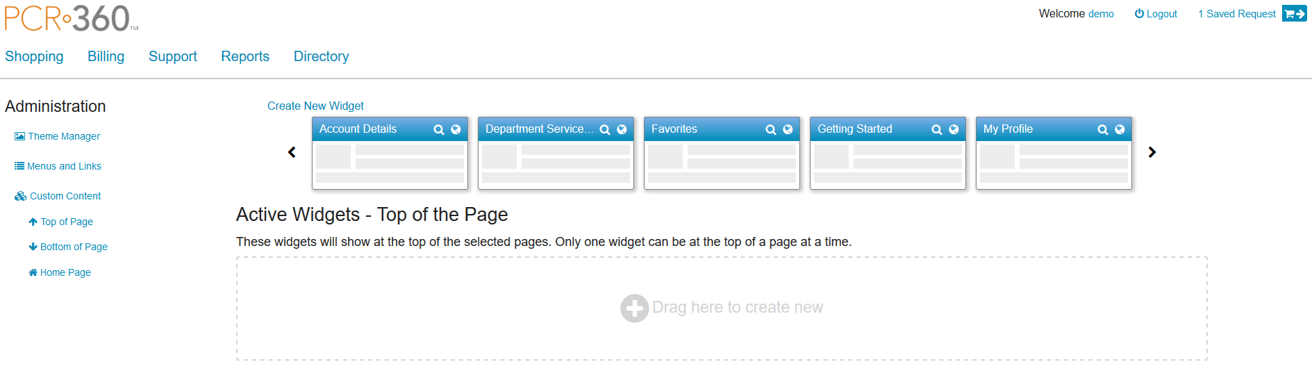
Top of Page Widgets
This page gives a User the ability to click and drag existing Widgets into the "Droppable Zone".
Top of page Widget
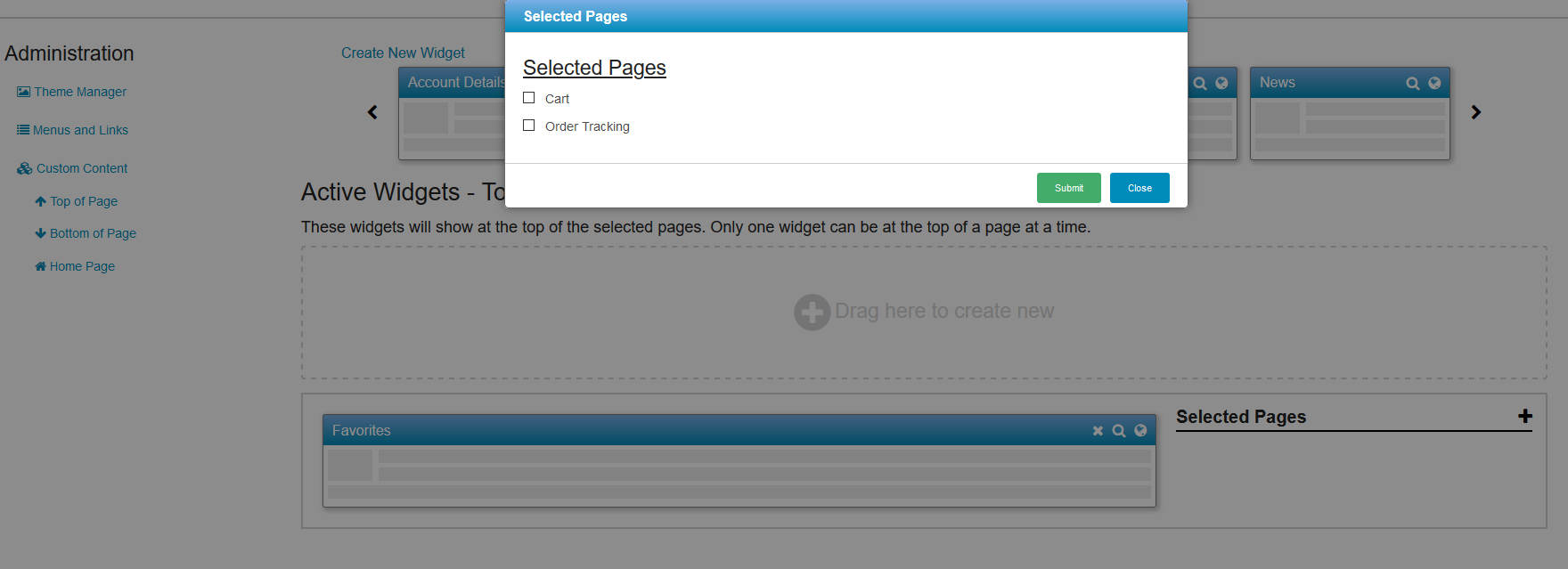
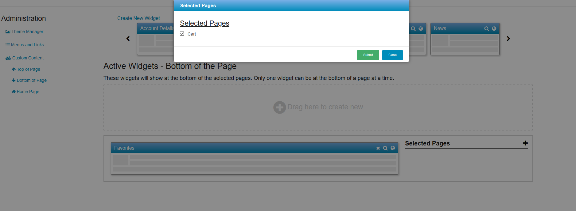
This will activate the Widget and allow you to assign it to a page(s). Once you select the proper pages and click the
button, the changes will automatically be saved.
Select Pages
Note: Only one Widget can be at the top or bottom of a page at a time.
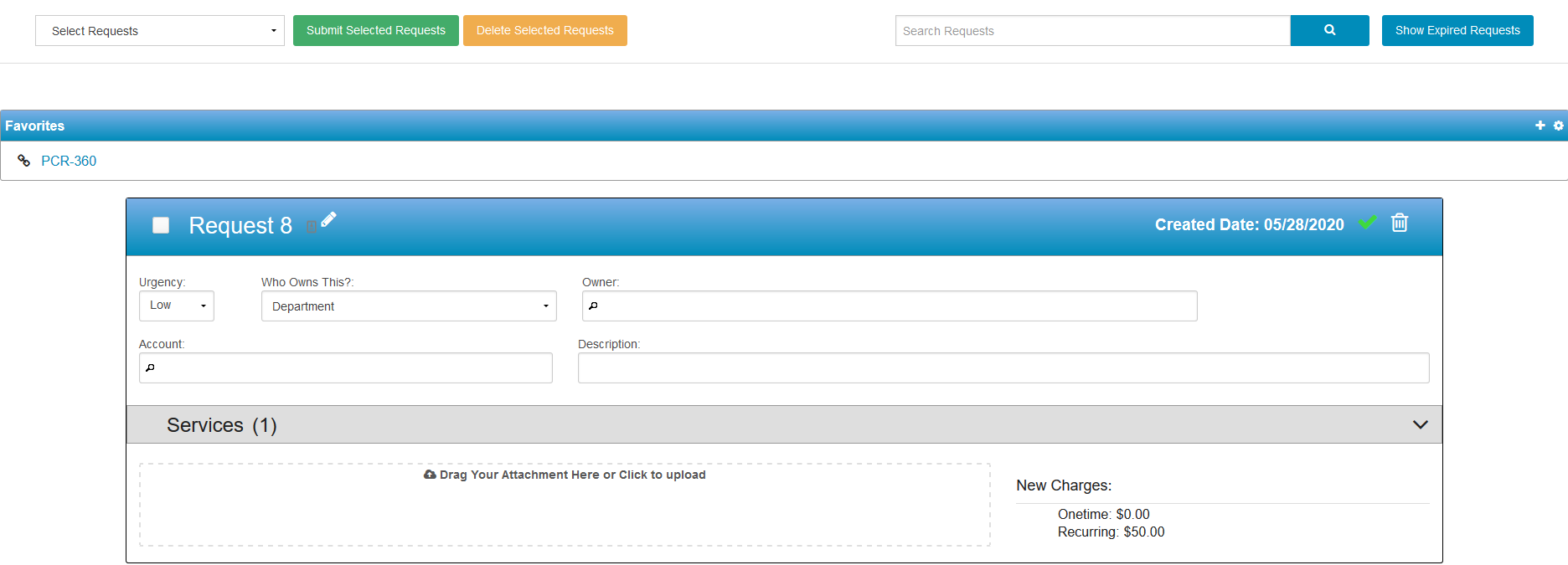
You can then navigate to the selected page(s) and see the Widget.
Top Widget on Cart Page
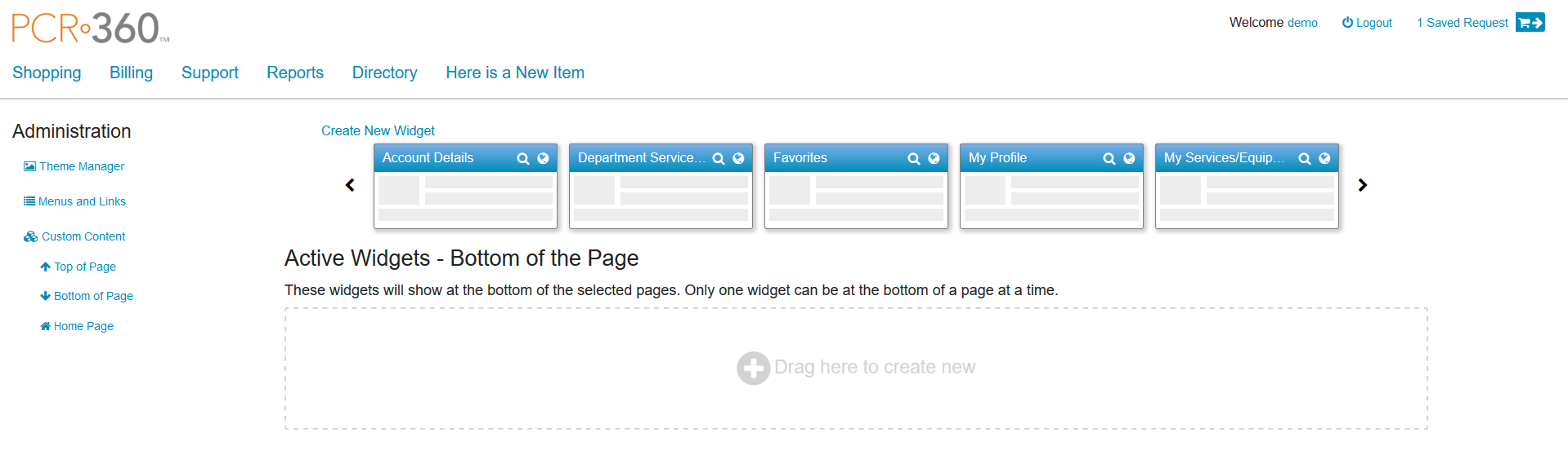
Bottom of Page Widgets
This page gives you the ability to click and drag existing Widgets into a "Droppable Zone" to create a new Widget.
Bottom of page Widget
This will activate the Widget and allow you to assign it to a page(s).
Select Page
Note: Only one Widget can be at the top or bottom of a page at a time.
You can then navigate to the selected page(s) and see the Widget.
Bottom Widget on Cart Page
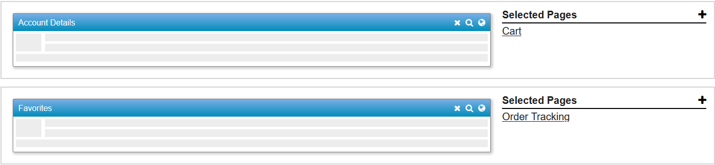
Assigning Widgets to Pages
You can assign multiple Widgets to multiple pages but only one Widget can be on a page at a time.
Mutiple Widgets on Pages
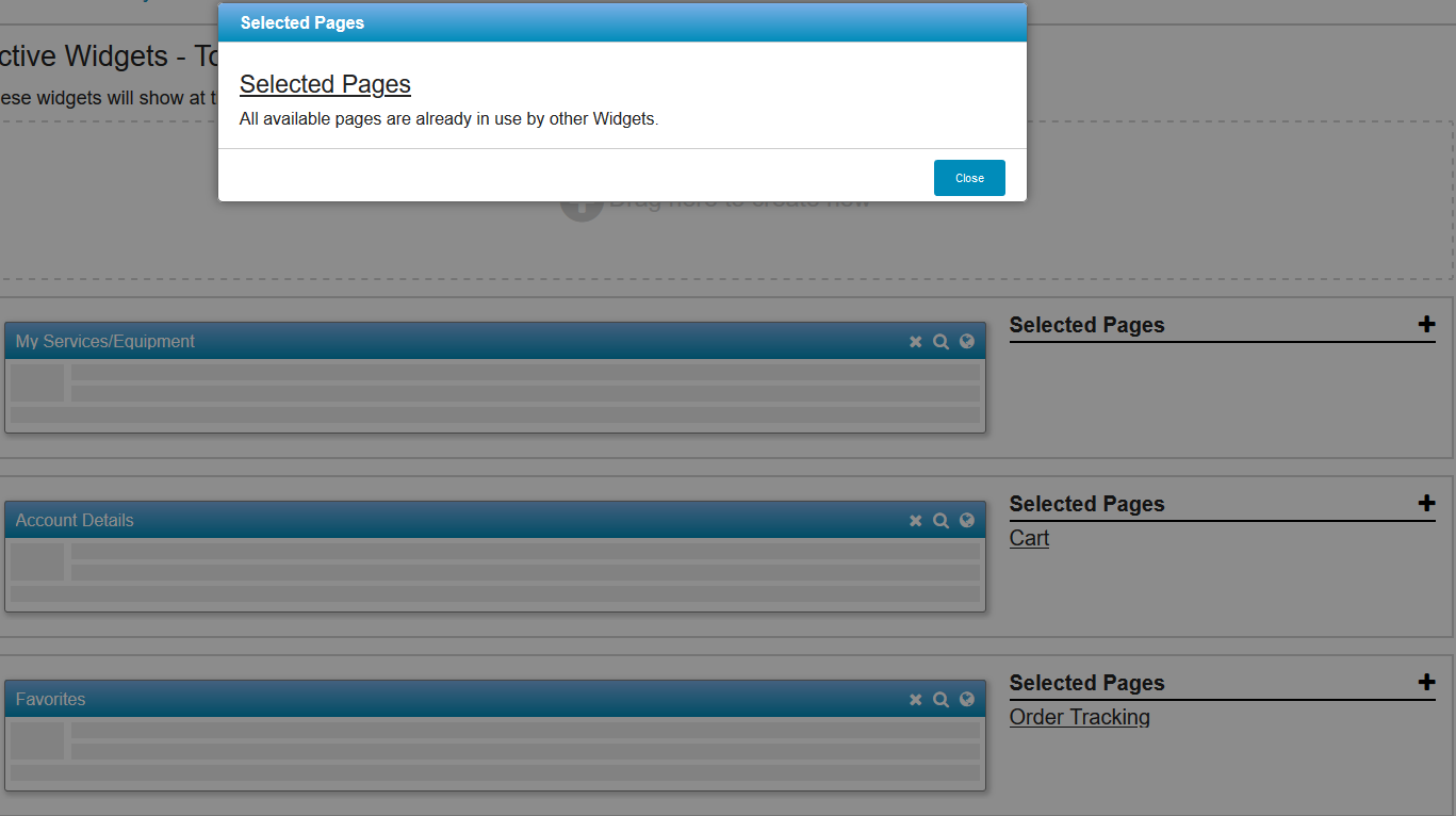
If there are no applicable pages when you click "Select Pages", a message will pop up declaring all pages are in use.
Selected Pages are in use
Account Profile Page
Account Profile Page example
From the Account Profile page, a User can individualize their displayed Widgets as defined by their Organization, or restore the system setting by clicking on the


 - The Preview Icon, when clicked, will allow a User to see what the Widget will display when a User navigates to the page with the Widget present.
 - The Delete Icon, when clicked, will delete the custom Widgets. This is only for custom Widgets.
 - The Remove Icon. When a Widget is added to a page, the Delete icon is replaced with the Remove icon. Clicking the Remove icon will return the Widget to the Widget Carousel.
 - The System Widget Icon denotes a Default System Widgets that can not be Edited or Deleted.
 - The Lock Icon Indicates there are roles assigned to that widget. If there are roles assigned to a Widget, then only Users with one of those roles can see the widget. You can click the icon to see which permission is assigned. If no roles are assigned, then any User will see those widgets.
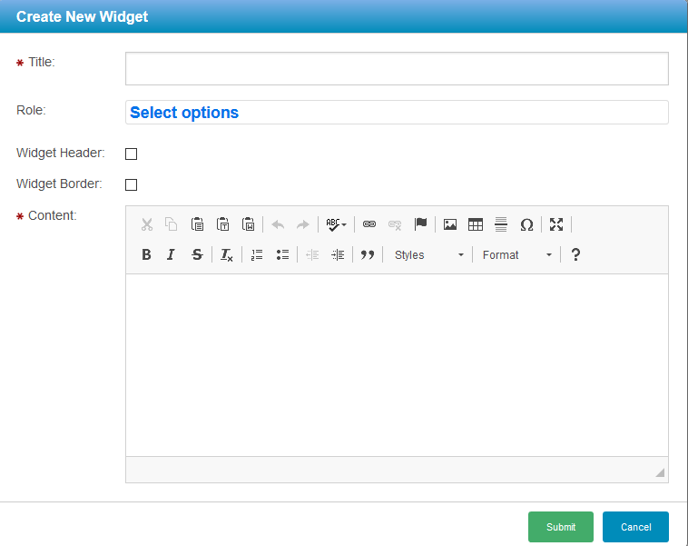

button